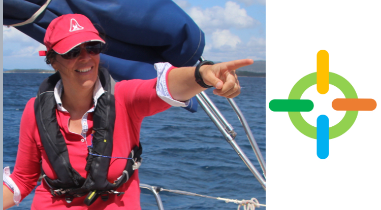
Our logo story
Do you know the story behind our logo?
When Heiske was searching for her ‘Native Genius’ she realized that the compass was the best metaphor for her.
No matter where she is (on her boat, with friends or working for one of our clients) she loves to take all factors into account and determine, based on those factors, the optimal direction.

This can be navigating her boat while taking into account the context: her crew, the waves, the wind and other boats. But it can also mean supporting an organization in putting a clear dot on the horizon, taking into account the complex and changing environment.
To be able to ‘navigate’ successfully, you need to leverage all strengths of the team. That is what the colors in the logo refer to; leveraging all potential.
The shape is a compass and an ‘aim’ for the target; the long term goal. It is a simplified version, because our strength is making complex things simple.
That’s our logo story!
